As you know, I upgraded the Dogs page last month. The truth is that I was never really happy with it. I don’t know about you, but I didn’t like having to click on a dog’s picture in order to read his or her team card and see more info. Plus, opening and closing new windows all the time just seemed kind of lame.
The problem was that I didn’t know how to do anything about it.
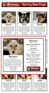 It’s bugged me, though, so I decided today was the day to fix it. Twelve hours later — and a whole bunch of messing around with HTML, Java and Blogger (none of which I really know much about) — and I think it’s fixed.
On the “New, New Dogs Page” all you should have to do is move your cursor over a dog’s picture and a bigger, fuller image window will appear. For those who have “Meet The Dogs” videos, there will be a link in the bottom of the window which will open that page for viewing.
The code for doing all this is a little complicated, but it should work fine for everybody who has a current web browser, Java update, etc.
Please let me know in the comments if it works for you, and whether or not you like it. My boss is going to hammer me pretty hard for not getting anything else done today, so I hope the answer is “yes” to both!



I really like the new dog page and it works well for me! I use the latest Firefox.
Fantastic, Mac! Thanks for taking the time to figure it out. I think the boss will be pleased!
The new dog page is GREAT! Love it! A big improvement for those of us who live off the beaten path and cannot get high speed at our location. Your videos take us a looooooooong time to load, but are worth the wait. Merry Christmas ~ Hope Santa is good to the dogs!
I like the idea of it, but you have to scroll the page just right to see the box and that gets a bit annoying. Is there anyway to make the box always open in the middle of the page?….probably not, it's not really a big deal.
Howdy! Thanks for the quick feedback… I really appreciate it… I agree that the window dropping down below the dogs was a problem… I've made a couple of changes: The window now scrolls up "in front" of the dog… That should help… Also, I've made the left hand column of dogs open on the left so you can still see dogs to the right, and I think that helps, too… Those are the only options available in the script I'm using… up-down, left-right…Anything else and I'd have to go back to the drawing board… So, give it a try now and please let me know! — Thanks, Mac
I think it works great the way you've fixed it now. It sure beats opening up tons of windows!
Great work Mac!
I love it! Good work.
Looks good, but FWIW I'm in Firefox (current release) and am getting the left side of the left column popups cut off unless my window is very wide.
Okay!… Many thanks to all!… Two last tweaks… I thought it was a good idea to have the left column of dogs open on the left (to aid in viewing/navigation) but I understand that it requires having a wider browser window to avoid cutting them off… So, I've made all the windows open on the right side to stay within the width of the page… Also have added an extra blank line space between rows to give you a place to scroll through without triggering pop-ups… Seems to me this is the best overall compromise… Again, thanks very much… I'm glad to know it works and is well received! — Cheers, Mac
Thanks Mac for all your work on the website. The new dog page is great! Dave in NC
Dog page looks great Mac – works really well too. Thanks for giving us fans such a great Christmas present!
What a great resource!